Choose a Collaborator below:
- Adam Gault & Stefanie Augustine (1)
- Andreas Gebhardt
- Betterment Bureau (Loyalkaspar) (1)
- Bran Dougherty-Johnson (1)
- Cassiano Prado, Mario Sader & Ralph Pinel
- Dave Baum (1)
- Decoy (3)
- Dom Del Torto
- Dylan White & Andy Hague (1)
- Echolab
- Foreign Office (1)
- James Wignall (1)
- Knife Party (8)
- Mighty Nice (2)
- Parasol Island (1)
- Sehsucht - Directed by Mate Steinforth (1)
- Thiago Maia (3)
- World Leaders (1)
- Yum Yum London (2)
‘Idealised 60’s’ Production Process
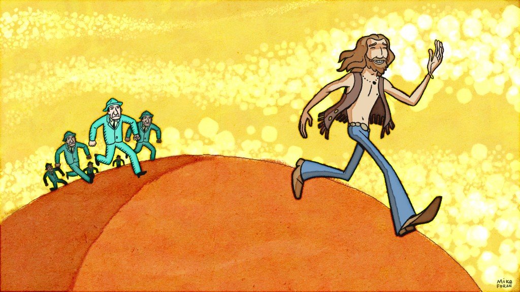
For this section of the film I wanted to evoke the psychedelic 60’s, but not fall into the common stereotyped portrayals and techniques. I needed something that looked like it might have come from that time, but also had a more contemporary quality. We drew inspiration from a number of sources from the 50’s and 60’s to achieve this goal. Simon and I were both very influenced by the work of Milton Glaser. I admire the seemingly effortless flowing quality of his illustrations, with colors and shapes billowing across the page. I particularly respond to his watercolor work with it’s fine hand and texture.
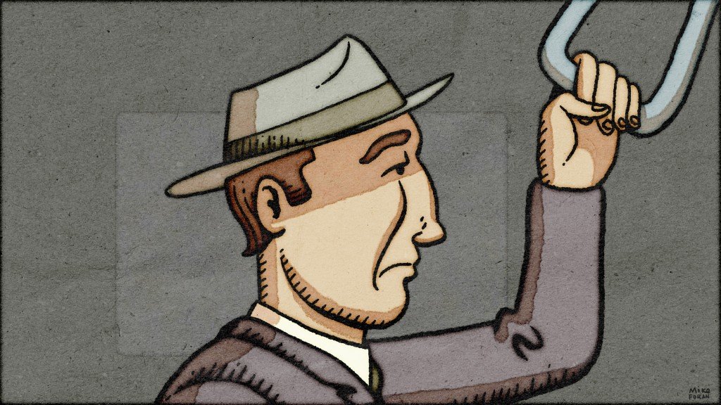
The theme of this piece is the abandonment of the consumer culture of the 50’s, so I referenced old advertisements from the 50’s, with all their bright shiny opulence , materialism and canned optimism. The influence of this style can be seen in the opening train design and in the consumerist landscape that closes this section.
I knew I wanted a vibrant watercolor look to the piece, but hand painting a work on this scale would have been prohibitively time consuming. I spent about two weeks refining techniques that combined hand drawn elements with a level of computer refinements to achieve a very convincing digital watercolor application that could be animated. It was still time consuming to produce, but not nearly as involved as actually painting each frame with real watercolor paints. All the artwork was illustrated and rendered completely in the computer using digital tools. Nonetheless, it has a warm, natural feel.
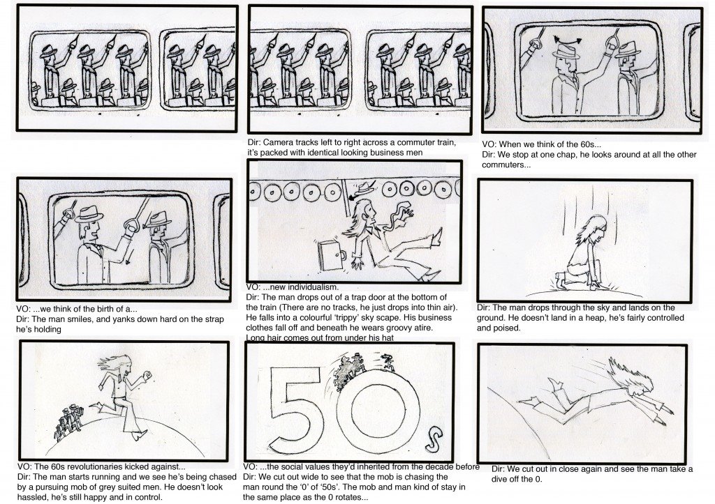
The animation work itself was hand drawn on a computer with a Cintiq tablet using Photoshop, Flash and After Effects CS4. I took Simon’s excellent storyboards and designed the characters and props using Photoshop.
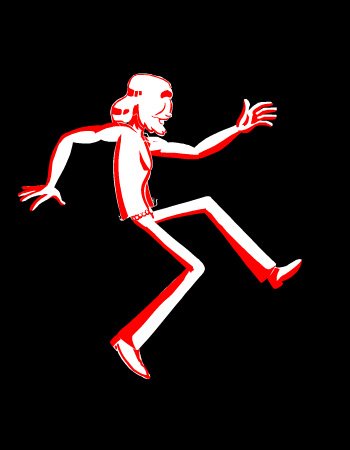
These drawings were then brought into Flash for cleanup and animation. As with all of my animation work, it is a blend of styles, using traditional hand-drawn key frames mixed with motion graphics. The animated pieces were passed along to an assistant to add shadow layers and color. These files were then brought into After Effects for compositing, motion graphics, texture and effects.

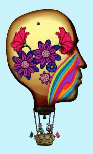
One of the most complex elements was the head-balloons with their psychedelic idea cascades. There is so much going on in this that it’s hard to concentrate on any one thing, which was pretty much the intent. But I was a little disappointed that my animation of a flower growing, blooming, withering and dying, got lost in the cacophony.
Thanks to Simon for the opportunity to work on this exciting project.
-Michael Foran



View all
Facebook