Choose a Collaborator below:
- Adam Gault & Stefanie Augustine (1)
- Andreas Gebhardt
- Betterment Bureau (Loyalkaspar) (1)
- Bran Dougherty-Johnson (1)
- Cassiano Prado, Mario Sader & Ralph Pinel
- Dave Baum (1)
- Decoy (3)
- Dom Del Torto
- Dylan White & Andy Hague (1)
- Echolab
- Foreign Office (1)
- James Wignall (1)
- Knife Party (8)
- Mighty Nice (2)
- Parasol Island (1)
- Sehsucht - Directed by Mate Steinforth (1)
- Thiago Maia (3)
- World Leaders (1)
- Yum Yum London (2)
Wikipedia Section Build
I met Simon at F5 back in April last year. I pretty much cornered him after his presentation, but I’m glad I did, this has been an epic project for me personally, and on a larger scale something I’m extremely proud to be a part of.
We began this project with boards that Simon had drawn up. At this stage, the piece was to be dominated by time lapse shots of people at their computer or mobile device, showing the range of scenarios in which people may contribute to Wikipedia.


On our first meeting after receiving the boards, I used photos to illustrate the screen divisions – badly I might add, they are all over the place!
They do however give a good indication of how colour and content can be used to show the variety of activities and ideas written about on Wikipedia.
example of an opening shot:

screen divides into 4:

then 16:

then 64:

There is already a nice depiction of life shown here, and this was continued as a theme throughout. I would gather a series of clips that show the activities and interests of people.
With regard to building the sequence, the thinking here was that a block arrived at through screen division such as the one above could be duplicated and used in various ways to construct letterforms out of video clips – stacked to create the letter ‘I’ for example.
This still left the issue of repetition, which was a concern for a mortal like myself, but Dan Ebberts wrote us a fantastic script that allows the playhead to skip from one clip to another in After Effects if working in a comp that has many sequential clips.
I created a quick test using coloured solids, numbered from 1 to 10. The script works as a time remapping expression applied to a precomposed comp of sequential video layers. With the script running, this happens:
You can see that the clips are played back in a random order. The beauty of it is that if that same comp is duplicated, the clips play back in a different order – and with more clips, more variation is possible.
That 8 x 8 block made can now be made using 64 of these scripted sequences. The variation here is limited by the similarity of the colours (each is only a couple of values different to the last), and the duration of all blocks being the same, meaning they change at the same time. Lesson learned for the videos – they must vary in length.
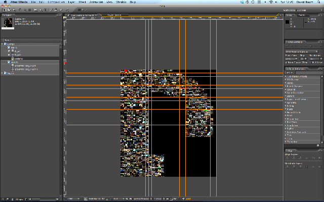
Here’s the timeline needed to get even this simple result!

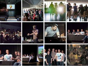
Having played around with the script using stand in colour blocks to save on render time and so on, I could see it worked so gave it a go using a selection of videos. Aplogies if you spot one of your own! I borrowed them all form my geeky folder of inspiration…none used for the final thing though
You can kind of see how it all works now – this block is a bunch of duplicated scripted sequences of video clips. Each duplicate produces a different playback order and of course the more clips used in the inital sequence, the better the randomisation when they are grouped like this. Each scripted sequence is ultimately treated as a pixel positioned within a comp to create the letterforms needed to spell out Wikipedia. Phew.
After this we decided it should be one camera move – no divisions before a move, just a camera pulling out to reveal more and more content until the end frame WIKIPEDIA is revealed. So back onto an animatic. As this thing is built in so many stages it felt more important than ever to let the OCD loose, and get everything right from the start. A mistake spotted during the final sequence would mean a lot of re-rendering.
So an animatic was essential, for me to have something to refer back to all the time. It came in mighty handy!
Signed off Animatic with singular camera move:
Incidentally, using an 8×8 format doesn’t allow for one image / clip to remain in the centre of the screen for the duration of the sequence, obvious to those who stop and check. D’oh! So I changed the format to 9 x 9, and this allowed for one smooth, singular camera move.
By this point I had decided to create the sequence letter by letter and parent them together at the end. This gave me clear targets to get done (a letter a day etc) and also meant that each could be rendered out one at a time before being brought back in for the final sequence, making for a more manageable work load for the computer and my brain, which is now a shriveled up lump.

With the script in place and the animatic signed off, it was just a case now of getting more footage and beginning the build.
To make sure each clip was never shown beyond its 100% scale limit, when pulling out from one HD clip to reveal 8 surrounding it, I had to create a 3x HD sequence of 9 clips each at 1920 x 1080 for the initial pullout (the red intro clip shown below is 1920 x 1080, surrounded by 8 videos of the same size)

This is replaced by a project of 25 clips, each at 640×360:

This scaled division continues as the camera pulls out, and one sequence is replaced by the next. This avoids having 9 Full HD videos being continuously rendered all the way down to the final, almost invisible, size.
Here there are 49 clips at 400 x 225 (slightly larger than required, then tweaked for exact fit). You’ll notice a 4 clip gap at the top left – this paves the way for the centre of the letter P:

And finally 70 clips at 288 x 162 (9×9 = 81, minus the 11 removed for the centre of the P).
In total I used about 150 shots so there was no need for any repetition until most clips are too small to see.
From here on in the P takes over, and brings with it the remaining letters. The gap now shows the beginnings of the hole in the P.

The P…

A few samples from the letter builds – you can start to see repetition here, don’t tell anyone:
D being built up – block by block:
D Finshed

more letters


You get the idea!
Knowing I would create each letter individually meant I could plan the sizes of the letters and comps. The letters ‘W’ and ‘A’ appear only toward the end of the sequence and because of this need never be larger than about 800 x 800 pixels. By contrast, the letter P, being the behemoth that appears first, weighed in the size mentioned in the error message until I chopped it all up and glued it back together – I rendered that in 6 sections and parented them together into a final big P.
This was a big help anyway – but meant all clips had to be rendered out at specific sizes to the letter to ensure uniformity in the appearance of resolution for each one. As mentioned earlier, each letter is 62 clips high, but the size of the clips used varies greatly. This is much the same of course as when the pixels of an image appear large when close up, but are individually invisible when viewed at the intended size / resolution.
The end frame:

Endframe tidied up a bit – kerning sorted for you typophiles:

Final render before sound:
With regard to the shots used for the sequence – I filmed most for the project or selected them from my library for their light, colour, and / or activity. Light and colour become more important than activity as the sequence progresses and the clips become too small to show detail.
I used a couple of shots from jobs for The Light Surgeons , reused here with kind permission from Chris Allen, two were donated by Joe and Luke of The Institue for Eyes and a few were parted with by friends. A big thanks to Duncan McDade and everyone who helped.
Thanks for reading and if anyone knows of a better way I could have done this – don’t tell me!

2 Comments
Awesome work Dave! I came across this while looking around the site. It really is brilliant! I am certainly looking forward the the next upload. This clip, along with Simon and Andreas’ shots – it is going to be way cool!
TimR
Okay, that’s awsome!
Great work Dave, very impressing!